
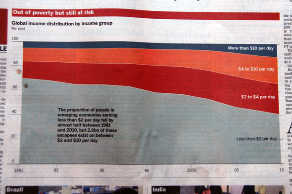
The Financial Times in April 2014 - on a series on the world's vulnerable middle income groups - published this great graphic. It shows the distribution of income (on a USD per day basis) for the world's population over the period 1981-2010. It shows the remarkable rise of the proportion of the global population that has moved into the global middle income group - where that is defined as those living on between $2 and $10 a day (from roughly 20% of the global population to approximately 45%).
In the same 39 year period the proportion of the world's population living on less that $2 a day fell dramatically from c70% to c40%.
This huge fall in the lowest levels of poverty on global terms is largely due to the rise of the the Chinese, Indian and other emerging economies. But as the series of articles in the FT was at pains to point out the new global middle income group (2.8 billion) living on between £2 and $10 a day faces uncertain times and remains particularly vulnerable to personal changes of fortune and economic shocks.
This is a link (which in turn links to the FT Fragile Middle series of articles) to an interesting article by Branko Milanovic in the FT on the need to support development and redistribution as national inequalities rises within the overall dynamic of the emergence of a 'fragile middle class'. He reckons a fairer measure of the fragile global middle class is those on between $4 and $6.5 a day - which is about 13% of the global population - which is, as he says, still 'relatively poor'.
Write a comment